What Is Responsive Web Design and Why It Matters in 2025
In today’s digital landscape, users access the web through a variety of devices—smartphones, tablets, laptops, smart TVs, and more. With mobile traffic surpassing desktop in most regions of the world, it’s no longer enough for a website to look good on just one screen size. That’s where responsive web design comes in.
What Is Responsive Design?
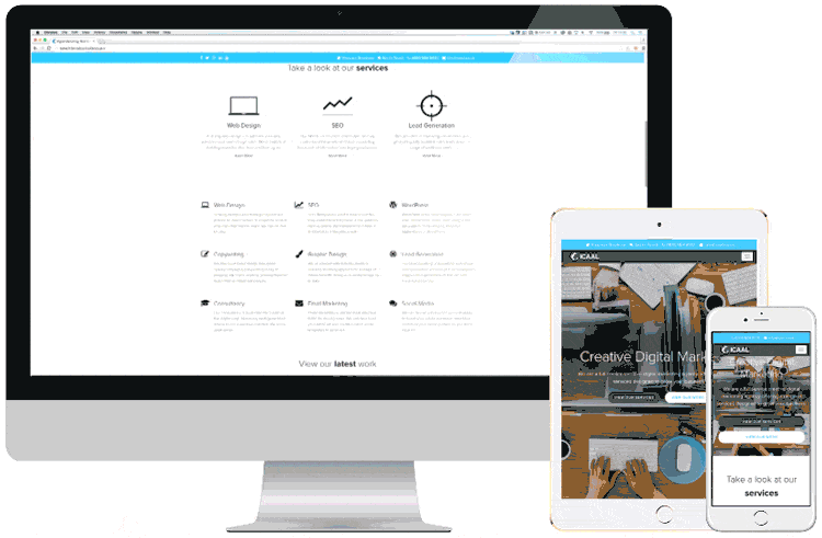
Responsive design is a web development approach that ensures your website layout adjusts fluidly across different screen sizes and devices. Whether someone is browsing on a 6-inch smartphone or a 27-inch monitor, a responsive site automatically rearranges content—text, images, buttons, and navigation—so it remains user-friendly and visually appealing.
Rather than building separate versions of your site for each device type, responsive design uses flexible grids, CSS media queries, and scalable images to provide one seamless experience.
Why Is It Important?
1. Mobile Usage Is Dominating
In 2025, over 60% of all global web traffic comes from mobile devices. If your website isn’t optimized for mobile, you’re losing visitors before they even start scrolling.
2. Better SEO Performance
Search engines like Google prioritize mobile-friendly websites. Since the introduction of mobile-first indexing, your site’s mobile version is now the primary version Google uses for ranking.
3. Improved User Experience
Responsiveness translates to faster page loads, easier navigation, and better readability. Users are far more likely to stay on your site—and convert—if it’s intuitive on their device.
4. Cost-Efficiency
Maintaining one responsive site is far less costly and time-consuming than managing separate desktop and mobile versions. It also simplifies content updates and maintenance.
5. Higher Conversion Rates
A smoother experience means more action: from purchases to sign-ups, responsive sites often outperform their non-optimized counterparts in terms of conversion.
How Does Responsive Design Work?
Here are the main principles behind it:
- Flexible Layouts: Pages are built using proportion-based grids instead of fixed pixel widths.
- Media Queries: CSS rules that adjust the layout depending on the device’s screen width, orientation, and resolution.
- Scalable Content: Text and images resize automatically to fit the viewing area without breaking the layout.
- Mobile-First Approach: Start with the smallest screen layout, then enhance progressively for larger screens.
Example of a CSS media query:
@media screen and (max-width: 768px) {
  body {
    font-size: 16px;
  }
}
Tips for Creating a Responsive Website
- Use a mobile-first mindset: Design for smaller screens first, then add features for larger displays.
- Keep navigation simple: Prioritize thumb-friendly menus and avoid overcrowded interfaces.
- Optimize images: Use responsive image techniques like
srcsetandlazy loadingto improve speed. - Test on real devices: Simulators are useful, but real-world testing is essential for reliability.
- Choose the right framework: Tools like Bootstrap or Tailwind CSS can speed up responsive development.
How to Check If Your Site Is Responsive
You can test responsiveness in several ways:
- Resize your browser window. If the layout shifts and content reflows smoothly, your site is likely responsive.
- Use built-in tools like Chrome DevTools or Firefox Responsive Design Mode.
- Try free online tools like:
Common Responsive Design Pitfalls
- Slow load times on mobile: If not optimized, heavy content can slow things down. Use image compression and code minification.
- Broken layout on some devices: Always test on multiple screen sizes.
- Touch targets too small: Buttons and links should be large enough for fingers, not just cursors.
Conclusion
In a world where attention spans are short and mobile devices are everywhere, responsive web design isn’t a trend—it’s a necessity. Whether you’re launching a new site or updating an existing one, prioritizing responsiveness ensures your content reaches and engages users on any device.
Don’t let a poor mobile experience cost you traffic, leads, or sales. Build smart. Build responsive.